
Temporal Heatmaps for Visualizing Sequential Features
Azqa Nadeem ·In this article, we show how to visualize sequential data with Temporal Heatmaps, using examples of analyzing malware and IoT device behavior. You can access code snippets from this Jupyter notebook.
Sequence data
Sequences are everywhere, and it is easy to see why: time is continuous, so why not the data that models behavior? This sequence data can be anything, ranging from speedometer measurements for a car, to packet sizes transferred over a network. This type of data is used regularly in many fields, e.g. to perform anomaly detection in cybersecurity, gesture recognition in computer vision, and DNA sequencing in bio-informatics.
A common problem that we have to deal with when handling sequences is: how to measure the similarity between them? Let us consider a use-case:
Clustering Sequences
Suppose we are given a bunch of sequences that have to be grouped based on similarities. How would we determine which of the sequences are alike?
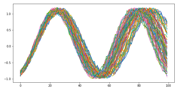
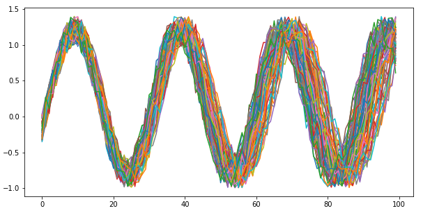
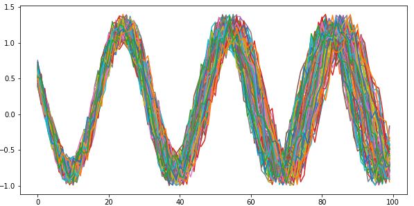
For the sake of this article, let us suppose that the sequences are sine curves with varying noise, phase and frequency.
A Jupyter notebook with the code snippets can be found here.
Using machine learning, clustering may be one way to approach this problem. An important question arises: how would we encode the sequences as input features?
If we were to collapse the sequences into aggregates, such as mean and standard deviation, there is a chance that we mistakenly consider two sequences as similar (due to similar aggregates) that were temporally different. Fig. 2 shows one such example, where the sequences have identical mean, standard deviation, minima and maxima, yet they are temporally different.

The other option is to use the sequences themselves as features. We can employ sequential machine learning: after computing pairwise distances between sequences using a distance measure, such as Dynamic Time Warping or Frechet distance, we can use any traditional clustering algorithm to group similar sequences together.
Visual analysis of clusters
Now for the big question: after the clustering is complete, how do we measure the degree of cluster homogeneity – how similar the sequences are within each cluster?
Since each observation inside the clusters is a sequence, typical numeric measures based on cohesion and separation are not very meaningful. Performing dimensionality reduction in order to plot the 2D projection of the data using Principle Component Analysis or TSNE is a good option, but is not without its limitations.
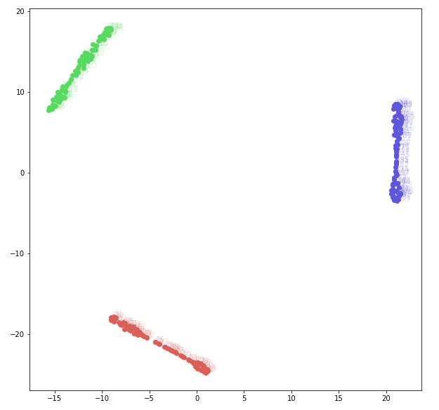
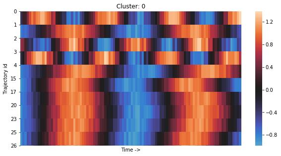
Fig. 3 shows the TSNE plot of the Sine Curve dataset. Each point in this plot is a 2D projection of the input sequence. The data seems very well-separated in three classes. A TSNE plot shows an approximation of the data in a lower dimensionality, whereby the points close to each other are approximately similar to one another.
Indeed, dimensionality reduction gives one way to visualize sequence data, but it is only just an estimate. In the absence of ground truth, the TSNE plot cannot tell whether any clustering mistakes have been made, which is a huge problem. For this reason, it is important to view the cluster content and verify cluster quality. To this end, we use a modified variant of heatmaps, which we call Temporal heatmaps.
Each cluster gets its own temporal heatmap. In a temporal heatmap, each row represents a feature sequence. The longer the sequences, the wider the heatmap becomes. The key idea behind temporal heatmaps is to utilize the natural tendency of humans to detect visual patterns, also known as Pareidolia, to our benefit. This allows to clearly see regions of similarity in sequences.
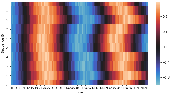
Fig. 4 shows an example of a temporal heatmap. It shows 10 sequences taken at random from one of the Sine Curve dataset classes. These sequences are all very similar with slight delays, which appear as rough vertical patterns.
What kind of patterns to look for in temporal heatmaps, is an important question. In general, vertical patterns in a heatmap indicate correct clustering. Below, we discuss the different type of clusters that one may encounter when working with temporal heatmaps. As we will see, measuring cluster quality is a subjective operation.
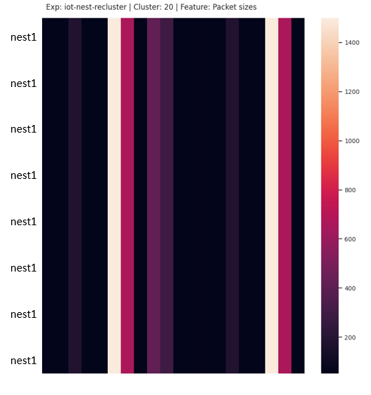
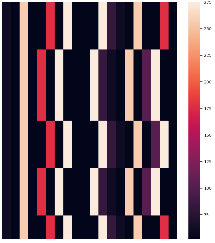
i) A cluster with identical sequences
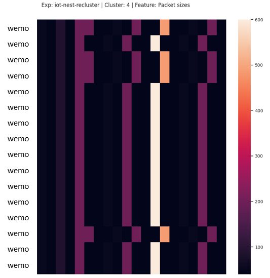
If the sequences are perfectly aligned, the heatmap contains un-interrupted vertical artefacts. Also, the colors in each vertical pattern are identical. This is the case where all sequences in the cluster are exactly identical – a perfect cluster. Fig. 5 shows a cluster with 8 identical sequences, generated from the network traffic of an IoT video camera.
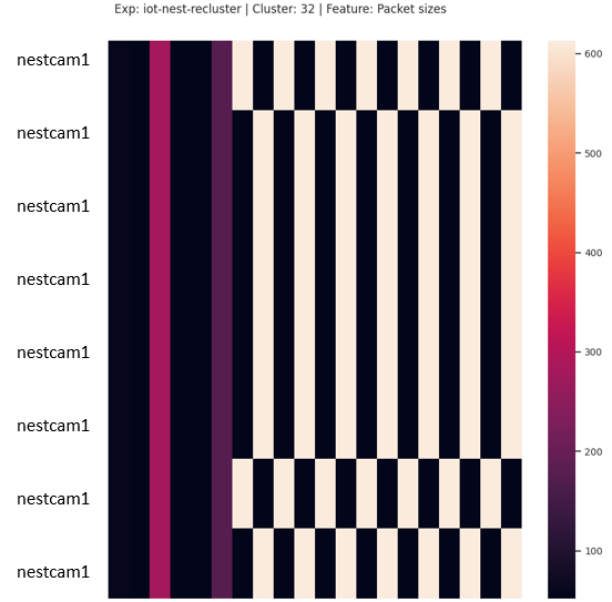
ii) A cluster with misaligned but identical sequences
Misaligned sequences are more common in practice than one might think. The misalignment is one of the reasons why many distance measures fail to work well with sequences. A cluster with misaligned sequences manifests as a vertical pattern with some misaligned cells.
In a dataset where misalignment is the least of the differences, i.e. when behavioral differences are rampant, this type of cluster would be considered good. Fig. 6 shows a cluster containing 2 misaligned sequences resulting from network traffic generated by several IoT devices. We consider this cluster as having no mistakes.
On the other hand, considering a dataset where misalignment is the only difference, the broken vertical pattern indicates clustering mistakes. Fig. 7 shows a cluster generated by applying K-means on the Sine Curve dataset. Out of the 10 sequences in this cluster, 7 belong to the 1st class, 1 belongs to the 2nd class, and 2 belong to the 3rd class. Since the difference in the classes inherently comes from the phase, noise and frequency shift, 3/8 sequences are considered as clustering mistakes.
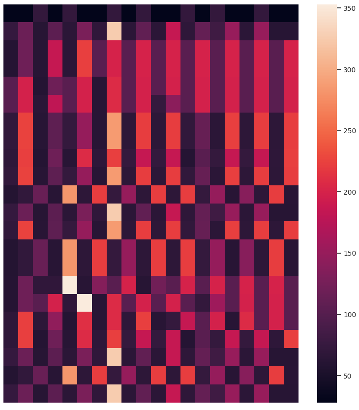
iii) A cluster with similar sequences
This is the case where the feature values in the sequences have a different range. In real-world data, this is a very common scenario, e.g. when the acceleration of a car changes slightly in each experiment run, it produces sequences that are behaviorally similar, but have different ranges.
A cluster of this type has vertical patterns, but no longer in the same color/shade. Nevertheless, depending on the colormap configuration, the value could appear in the same color. The rows that break the vertical pattern are potential “clustering mistakes” – if no better placement than the current cluster is found, these rows are deemed as true positives despite the color difference.
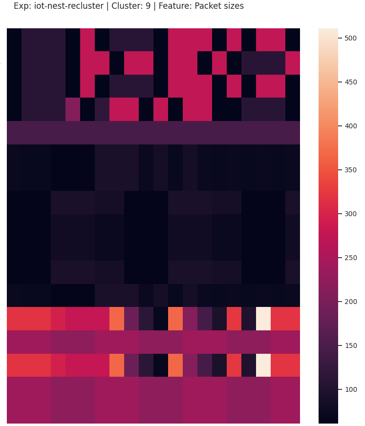
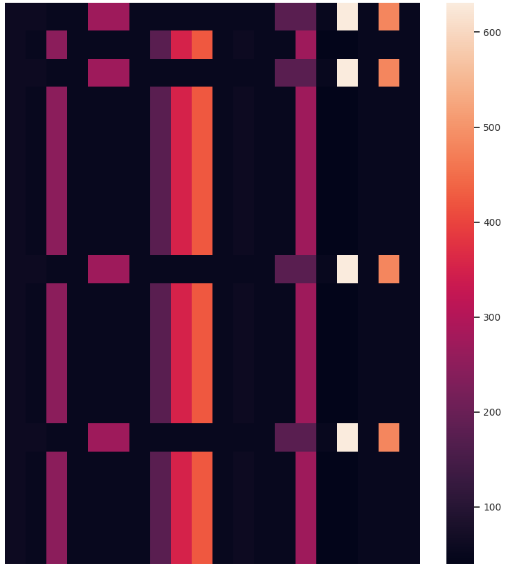
Fig. 8 shows a cluster containing network traffic of an IoT device. Out of the 16 sequences in this cluster, 4 are both misaligned, and have value differences that are significant enough to produce a different color. However, similar to the previous case, this difference is not big enough to be considered as a key behavioral difference.
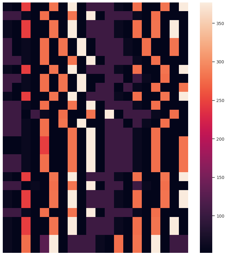
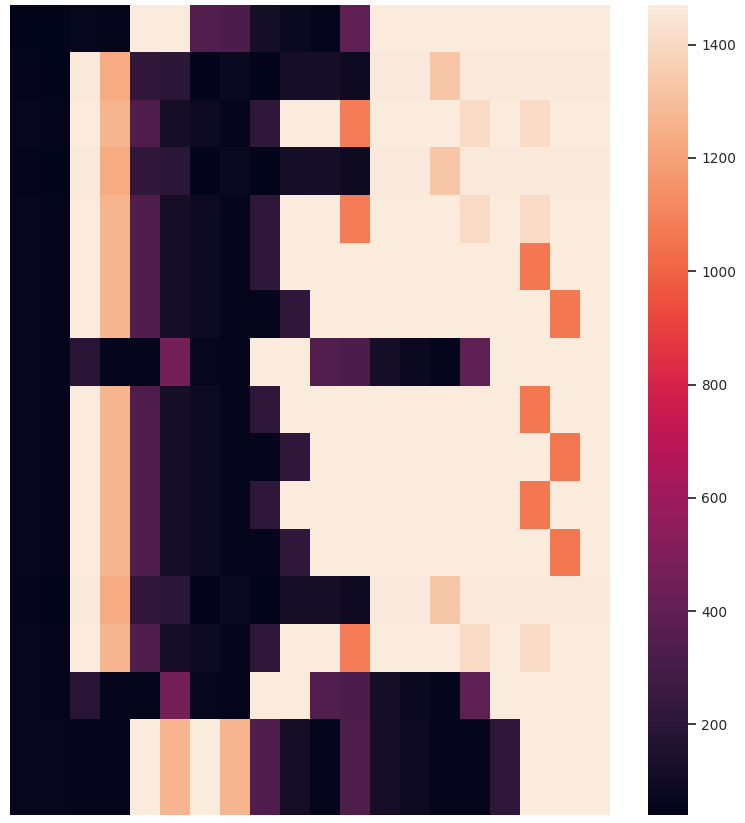
iv) A cluster with random sequences
As there are so many types of similarities that can be observed in a temporal heatmap, does it mean that a lack of vertical artefacts indicate a “bad cluster”? In practice, such a random-looking cluster contains left-over sequences that do not naturally belong to any other cluster. For example, when using a clustering algorithm that does not necessarily cluster all data, the left-over noise cluster might fall under this category.
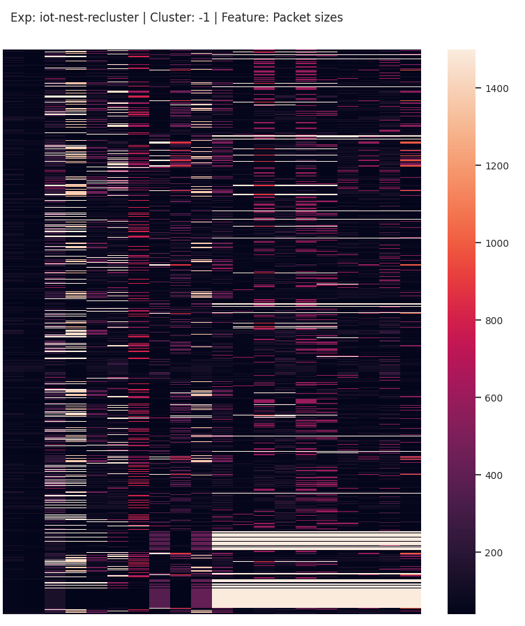
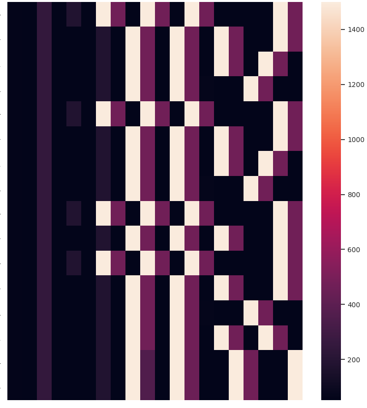
Fig. 9 shows the noise cluster containing 49 sequences from IoT network traffic that do not naturally belong to any other cluster. It is apparent that even this cluster does not look fully random – a second clustering attempt over these sequences will still produce a few clusters.
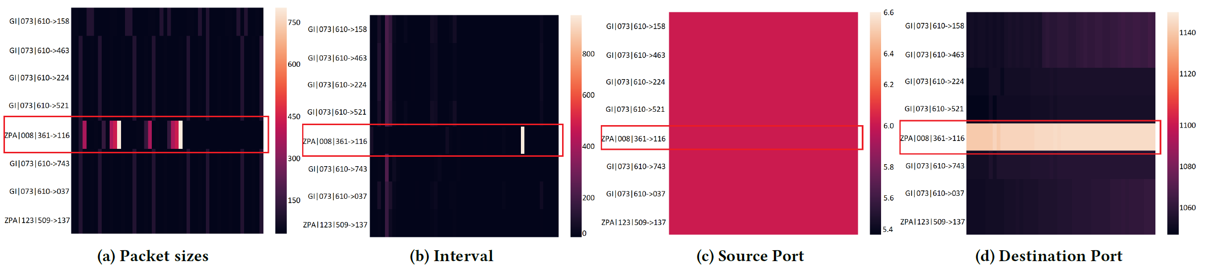
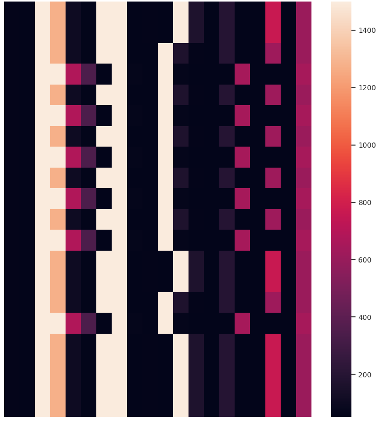
For a completely randomized look, we would need sequences that fluctuate a lot. For an analyst, this type of cluster will likely be very interesting, due to its uniqueness. For example, in a dataset composed of network traffic generated by malware, we clustered sequences of port numbers. Fig. 10 shows one of the clusters.
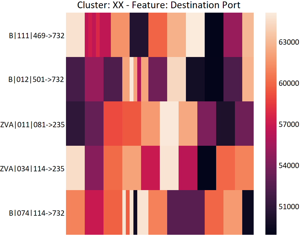
While it may look like a bad cluster, the sequences in this cluster are worse off if they are placed in any other cluster. Besides, it captures randomized behavior – this is the case of a randomized port scan, where attackers randomize the range of ports they want to scan as an evasive behavior. Because the randomized behavior is so different from all the other sequences, they get grouped together and are more likely to be checked by an analyst!
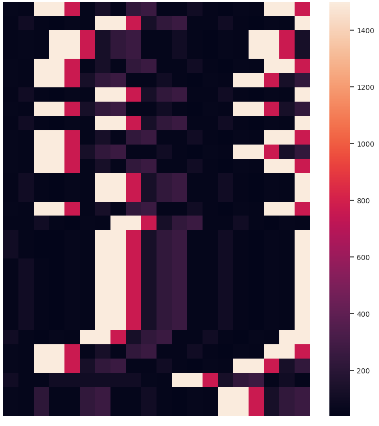
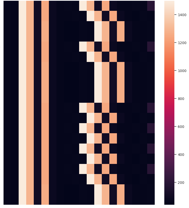
v) A bad cluster
While there are no inherent good or bad clusters, a cluster that contains many clustering mistakes would be considered bad. Fig. 11 shows a cluster where at least 3 distinct behaviors are grouped together. This may be because no other pairing for these sequences exist, or it could be a bad side-effect of computing pair-wise similarity over multiple feature sequences. Either way, we do not want this type of cluster!
Application
Our project MalPaCA produces temporal heatmaps as one of the clustering artefacts. MalPaCA clusters behaviorally similar network connections in order to discover distinct behaviors present in network traffic. To this end, it uses 4 meta-features, i.e. packet sizes, inter-arrival times, source and destination port numbers. Each cluster is hence represented by 4 temporal heatmaps, one for each feature sequence. For detailed explanation and examples, read the paper Beyond Labeling: Using Clustering To Build Network Behavioral Profiles Of Malware Families.
Analytical Artwork
Did you know that the banner image of our group’s website is adapted from a temporal heatmap capturing a port scan? Pretty cool, eh?!
Other than the obvious benefit of visualizing sequential data for verifying clustering results and data exploration, we like the temporal heatmaps because each clustering attempt produces fun images. Here are some recent ones generated when clustering network traffic of IoT devices. Enjoy!
If you use temporal heatmaps in your research, please consider citing the following reference:
@article{nadeembeyond,
  title={Beyond Labeling: Using Clustering to Build Network Behavioral Profiles of Malware Families},
  author={Nadeem, Azqa and Hammerschmidt, Christian and Ga{\~n}{\'a}n, Carlos H and Verwer, Sicco},
  journal={Malware Analysis Using Artificial Intelligence and Deep Learning},
  pages={381},
  publisher={Springer},
  year={2021}
}
References
- Nadeem, A., Hammerschmidt, C., Gañán, C. H., & Verwer, S. Beyond Labeling: Using Clustering to Build Network Behavioral Profiles of Malware Families. In Malware Analysis Using Artificial Intelligence and Deep Learning (pp. 381-409). Springer, Cham.
- Ten Holt, G. A., Reinders, M. J., & Hendriks, E. A. (2007, June). Multi-dimensional dynamic time warping for gesture recognition. In Thirteenth annual conference of the Advanced School for Computing and Imaging (Vol. 300, p. 1).
- Platt, A. R., Woodhall, R. W., & George Jr, A. L. (2007). Improved DNA sequencing quality and efficiency using an optimized fast cycle sequencing protocol. Biotechniques, 43(1), 58-62.
- Teng, M. (2010, December). Anomaly detection on time series. In 2010 IEEE International Conference on Progress in Informatics and Computing (Vol. 1, pp. 603-608). IEEE.